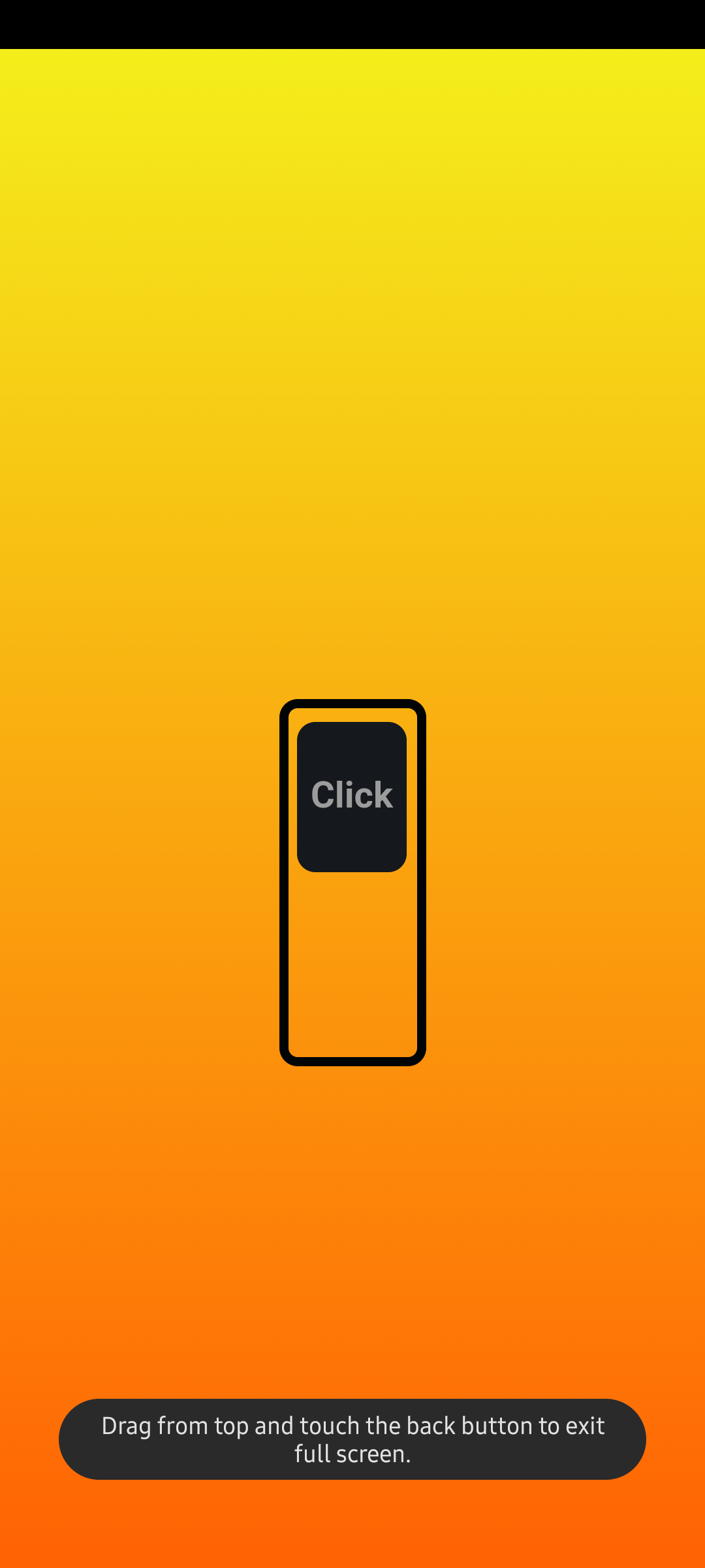
Styling native html checkbox
The need
While working with libraries like Bootstrap, Jquery UI etc you tend to forget even how native html elements look like. You would rarely see any popular site using the default look and feel of the browser.
Most of the libraries wrap native elements inside and create custom components using js and css. But just out of curiosity I wanted to checkout if the elements can be styled by just using css.
I started tinkering with basic elements like checkbox, radio button etc. Trying to modify the colors, background colors, borders. etc. But it didn’t work. I could change the height and width of the control only.
Reference
With a quick duckduckgo search, I stumbled upon the below article which gave a quick idea how native elements can be styled.
Just a quick read through the post and you will find that there are two important aspects to override native styles
- appearance property
- pseudo-class
.switch {
    appearance: none;
}
The appearance property has other values but as suggested by the article, I used none to remove the default styling.
Custom style
We can always add a css selector and apply some custom styles to setup our checkbox
#switch {
  margin: auto;
  width: 8rem;
  background-color: #000;
  height: 20rem;
  color: red;
  cursor: pointer;
  border: .5rem solid #010405;
  position: relative;
  border-radius: 1rem;
  appearance: none;
  transition: .3s ease-in-out;
}
::before
Now we need something to show that the checkbox is selected. Since we have removed the default styling, we can use a pseudo element to our checkbox
input#switch::before {
  width: 85%;
  content: "";
  text-align: center;
  font-size: 10rem;
  line-height: 16rem;
  height: 43%;
  color: cornflowerblue;
  background-color: #15191d;
  position: absolute;
  left: 7%;
  top: 55%;
  border-radius: 1rem;
  transition: .2s ease-in-out;
}
Most of the properties are just to add color to our control. The only required thing is to have content property set. You can also use \2713 for content to display a tick mark. Rest of the things are optional. Since I am using the box to simulate the check, I kept the content empty.
:checked
To differentiate between the checked and unchecked state, we can add some style to the :checked pseudo class.
input#switch:checked::before {
  top: 4%;
}
I am just changing the top property here to simulate a toggle button. You can pretty much do anything like changing the content or transition to a different color. Do note that I have added a ease-in-out transition just for visual touch.
:hover
You can also add a :hover effect just like how you can do with any other element.
input#switch:hover {
  border: 1rem solid #3d4951;
}
Live Test
Just for fun I created a small page with my custom styled checkbox.
The checkbox is completely a native checkbox. I added a small click listener to change the background of the page. For the background I created a small gradient animation to give some colors to otherwise empty page.
.lava #site-main {
  background: linear-gradient(0deg, #ff0000, #ff6604,#f3fb1d,#40ffe6,#f7e941,#84eb3c, #1fe600, #ff743a, #ff0000);
  background-size: 800% 800%;
  -webkit-animation: AnimationName 40s ease infinite;
  -moz-animation: AnimationName 40s ease infinite;
  animation: AnimationName 5s ease infinite;
}

@-webkit-keyframes AnimationName {
  0%{background-position:0% 14%}
  50%{background-position:100% 87%}
  100%{background-position:0% 14%}
}
@-moz-keyframes AnimationName {
  0%{background-position:0% 14%}
  50%{background-position:100% 87%}
  100%{background-position:0% 14%}
}
@keyframes AnimationName {
  0%{background-position:0% 14%}
  50%{background-position:100% 87%}
  100%{background-position:0% 14%}
}
End